I got sick. So, I decided to draw! This will be one of the old school posts where we show our work in progress, haha. I like to draw area by area, so I just chose once section of my piece and dedicated a day or two on it.
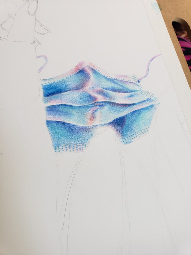
I really wanted to draw a mask since the beginning of the pandemic and I kind of want every artist to do this! In the future, everyone will look at art between 2020 – 2023 and see all the artwork that has vaccines, shots, syringes, masks, and viruses in them. I just think it will be really nice. Something for the grandchildren I guess.
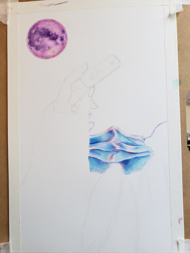
Another thing I wanted to draw was a moon. I’m obsessed with the sky and kind of wish there was a better view of the planets, rather than the little specks I see every day. I don’t even know how you can point out a planet vs. a star, but people can do it!
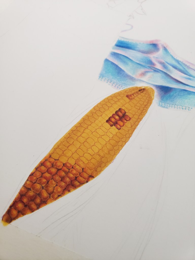


More corn. I like drawing on my bed, especially since the days I worked on this were particularly cool. So my bed was more cozy to be on than my desk.


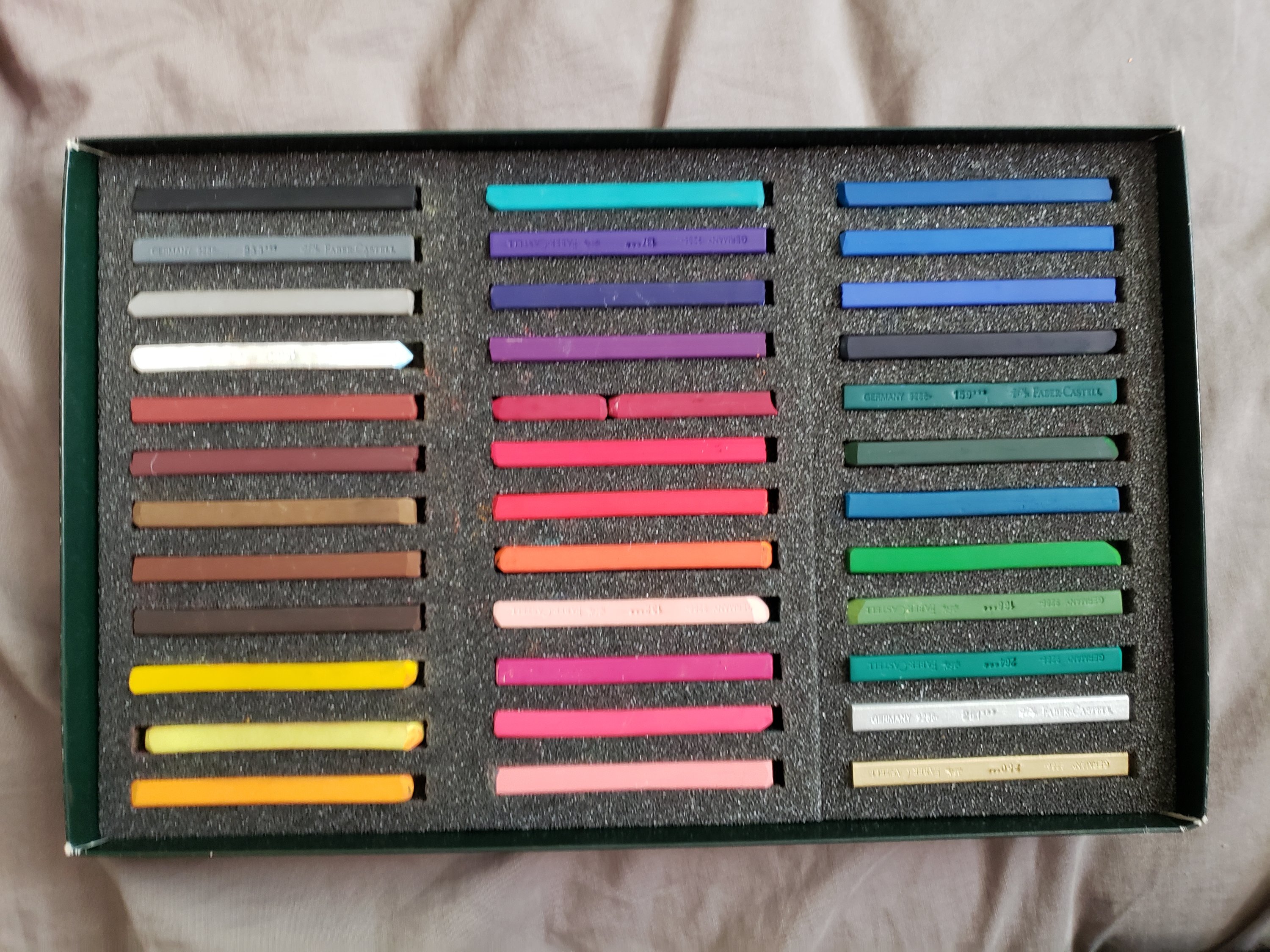
I did different colored corn too. I used an alcohol marker to color in the entire food first, then I went in with the Faber Castel pencils after.

At this point I did the same approach, but with my sweater. This is my favorite sweater.

Added some flowers, then I colored in the background. The background was actually the worst. I wanted to do a gradient, which I had done before, but because I started with a dark color first, I messed up. None of the colors blended so I ended up making most of the background purple. Next time I would color in the background all yellow, then go in with the darker colors.
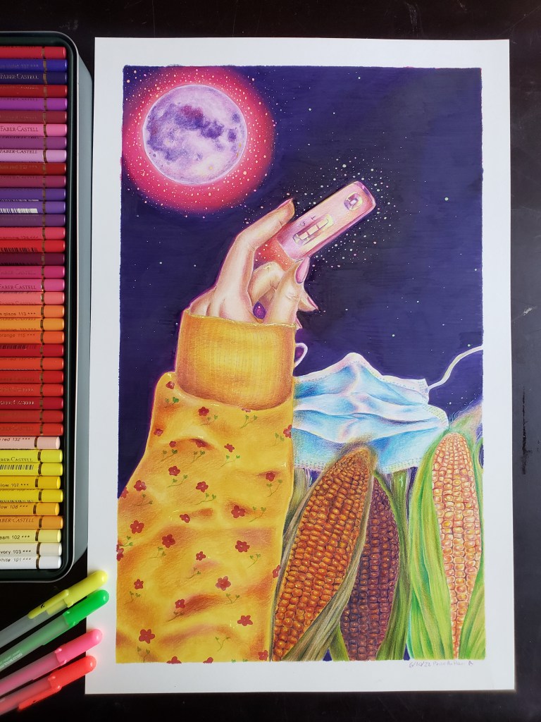
Title: Positive
Year: 2022
Dimensions: 11″ x 17″
Medium: Alcohol Markers, Colored Pencils, Gel Pens, on Strathmore Bristol Paper.
I’m a little worried about the next two piece I’m working on. I usually don’t like talking about sensitive issues, but sometimes you can’t help it.
Thanks for reading!